A new map, by Castle and HCMW!

Elite (and related) releases.
User avatar
Castle
Level 2
Posts: 86
Joined: Mon 18 Feb, 2013 7:33 am

A new map, by Castle and HCMW!

Postby Castle » Wed 07 Aug, 2013 1:17 pm

Hi all,

I have been away from the DOW2 Elite community for sometime. My apologies. I have been busy with RL stuff (graduation, woot), got hella sick at the start of the year, and I've even been playing some COH2 here and there instead of DOW2. I am remedying my ways though! Castle is coming back! 8-) Slowly but surely :P

My returning gift is this map:

https://docs.google.com/file/d/0Bzf_PpE44bLtUks4emFXbWZfeE0/edit?usp=sharing

I have tested the map extensively and thoroughly on my own and with others. I have made vast improvements since it's v1.1 beta release last week (a release I sent to Caeltos and Indrid... sorry guys, it was not that ready :oops: )

Since last week everything from balance issues and player perception of terrain, to technical bugs (bridges were totally f'd, fixed now) and vehicle "pathing" considerations have been adjusted and fixed.

The current name is 'Sandstorm at Calderis Canyon'. I am open to ideas on the name, but it is a canyon theme, and there is a sandstorm (it looks proper Sandstorm-y, not like some of the 'sand rain' on the other maps; I worked over the atmosphere settings for sometime ;) ) It is also a lush enough planet setting, not just a desert planet, as a nearby aquifer has given rise to the growth of thick jungle-like trees that block much of the view from various points on the map. Calderis seems fitting...

The brief synopsis for the back story I have thus far, is that a hive fleet managed to get plenty of nids on the planet surface in some obfuscated way...perhaps slowly growing over a long period from only a few spore that were never noticed or discovered. Thus, the Tyranid hive used the difficult and isolated canyon terrain as cover to buy time and "dig in" as it were. A small crossroads and trading community was the first to suffer and is now so much rubble, except for a few structures. Imperial Forces descended upon the Tyranid invasion as it began to surface and terraform massively, thus burning the area out with large arsenal and nuking the area from orbit...all seems appropriate but again I am open to ideas.

Additionally, Orks caught wind of the bug hunt and have used the distraction as an open window to drop some boyz planet-side to see the show. And the Eldar seem to have gated-in at some point, but who knows why... the only evidence of the race is a few burned out Prism cannon and the husk of a Wraithlord, all likely caught in the crossfire unable to gate-out soon enough....

[end back story part of dis post]

This project has taken hundreds of hours to complete over the course of what is now about eight months of personal time. I am confident I now know a great deal about using the DOW2 World Builder, even down to the assets that are destructible but should not be, or are bugged; what causes issues with bridges, why units spawn at turrets on map load and so on, and so on. At least 100 hours has been spent testing and investigating. There just isn't much info out there on how to do this...but I found all that is out there and compiled it all :twisted: I will post a link to the resources I have collected and the notes I have made. If anyone should need help or has ideas for getting maps from other sources and prepping them for Elite I am sure I can help more than adequately.

In making this map I have put in some form of every feature possible for a DOW2 map to have, with the exception of using splines. Thus, all the terrain you see in Sandstorm is hand-crafted, sometimes a pixel at a time...(I messed with splines, but besides bending Splats in fun ways, splines cause all manner of issue for terrain, with units or models firing oddly around or through them, and models not walking on them correctly). I have gone through with this very difficult thesis for map design as a personal challenge and as part of a career pursuit. Nonetheless, feedback is welcome.

I feel the map has a place for all skill levels. It is a micro-intensive map, but still plays out well for lots of straight forward combat. The result is a different, slightly more tactical--but still tight and competitively balanced--1v1 multiplayer map. There is plenty of cover, but it erodes easily and can even develop new options for cover as the map progresses. It involves height changes, lots of flanking options and bottle-necking opportunities. Along with plenty of open terrain. It is a map meant for micro practice, but brings lots of visual drama when all goes well... as DOW2 game-play has always brought, and Elite only furthers. In time I will make this a 2v2 and 3v3 map, using this canyon area as the center...3 maps tied together! :ugeek: :roll:

So, at this point the map needs to be stress tested somewhat extensively with all manner of different races, globals and various units etc. Everything works up front: balance of resources, their location, flow of the map to player expectation of movement and attack, pathing and major mechanics etc etc etc. But, for example, a nid terraform with an orbital strike all going off at the same time has not yet been tested.

So I need volunteers to join me and a few others for some testing sessions, or at least I need folks to get me some feedback and/or a replay or two. Speaking of, I will need to get a nice replay of this map out on Youtube. But for now, I shall link some crappy Steam screenshots. Enjoy teh pics!

http://steamcommunity.com/sharedfiles/filedetails/?id=167446439

http://steamcommunity.com/sharedfiles/filedetails/?id=167446427

http://steamcommunity.com/sharedfiles/filedetails/?id=167446415

http://steamcommunity.com/sharedfiles/filedetails/?id=167446399

http://steamcommunity.com/sharedfiles/filedetails/?id=167446392

http://steamcommunity.com/sharedfiles/filedetails/?id=167446376

http://steamcommunity.com/sharedfiles/filedetails/?id=167446366


It is late, I have finally put the finishing touches on turret placement and final fixes for garrisons, along with fixing pathing issues that would not quit. I will follow up soon!

for zee emperah!
FiSH
Level 3
Posts: 335
Joined: Wed 27 Mar, 2013 9:11 pm

Re: A new map, by Castle and HCMW!

Postby FiSH » Wed 07 Aug, 2013 2:26 pm

that's awesome, i'm down for testing. my steam name is ><%FiSH((@> and my steam ID is zjzjrjr
><%FiSH((@>
User avatar
Caeltos
Moderator
Posts: 1070
Joined: Sun 03 Feb, 2013 10:49 pm

Re: A new map, by Castle and HCMW!

Postby Caeltos » Wed 07 Aug, 2013 3:20 pm

Excellent map description, I'll give it a spin. :)

And of course, welcome back.
After
Level 1
Posts: 10
Joined: Wed 07 Aug, 2013 5:58 pm

Re: A new map, by Castle and HCMW!

Postby After » Wed 07 Aug, 2013 5:58 pm

Looks and sounds exciting! Will definitely check it out. =)
User avatar
Dark Riku
Level 5
Posts: 3082
Joined: Sun 03 Feb, 2013 10:48 pm
Location: Belgium

Re: A new map, by Castle and HCMW!

Postby Dark Riku » Wed 07 Aug, 2013 7:32 pm

Why not just name it Calderis Canyon?
No real need for the sandstorm. I think they'll notice in game if they didn't turn of the "rain detail" in option I'm guessing?

Other than that I would happily test the map.

Castle wrote:-1v1 multiplayer map

Sweet :p
Last edited by Dark Riku on Wed 07 Aug, 2013 9:10 pm, edited 1 time in total.
User avatar
Lulgrim
Admin
Posts: 1311
Joined: Sun 03 Feb, 2013 9:44 pm
Location: Grimdark
Contact:

Re: A new map, by Castle and HCMW!

Postby Lulgrim » Wed 07 Aug, 2013 9:08 pm

Name too long, Calderis Canyon or Sandstorm Canyon.
User avatar
Castle
Level 2
Posts: 86
Joined: Mon 18 Feb, 2013 7:33 am

Re: A new map, by Castle and HCMW!

Postby Castle » Thu 08 Aug, 2013 1:09 am

Lulgrim wrote:Name too long, Calderis Canyon or Sandstorm Canyon.


Dark Riku wrote:Why not just name it Calderis Canyon?
No real need for the sandstorm. I think they'll notice in game if they didn't turn of the "rain detail" in option I'm guessing?


Good point! Thanks guys. Map will be renamed after some testing is done, and once the image files at loading are reworked. For now the map name shall be overly descriptive :D
User avatar
Castle
Level 2
Posts: 86
Joined: Mon 18 Feb, 2013 7:33 am

Re: A new map, by Castle and HCMW!

Postby Castle » Thu 08 Aug, 2013 1:11 am

Caeltos wrote:Excellent map description, I'll give it a spin. :)

And of course, welcome back.


:mrgreen:
User avatar
Castle
Level 2
Posts: 86
Joined: Mon 18 Feb, 2013 7:33 am

Re: A new map, by Castle and HCMW!

Postby Castle » Thu 08 Aug, 2013 1:14 am

FiSH wrote:that's awesome, i'm down for testing. my steam name is ><%FiSH((@> and my steam ID is zjzjrjr


I remember seeing you around for 3v3 matches Fish ;) I will add ya sometime today!
User avatar
Indrid
Moderator
Posts: 898
Joined: Mon 04 Feb, 2013 5:06 pm
Location: London
Contact:

Re: A new map, by Castle and HCMW!

Postby Indrid » Thu 08 Aug, 2013 4:09 am

I think the map has a lot of problems tbh.

There are many hard choke points, including the NE VP which only has two points of entry iirc; both very narrow and far apart. Areas of great interest should always have three points of entry if possible, unless the points of entry are wide enough to accommodate an entire army-push, but even then you should try to avoid it. In this case they are just too narrow. There are many other instances of extremely tight corridors which are just gonna turn into frustrating death traps covered by set-up teams/turrets. You should always give a reasonable option to flank a set-up team/turret if possible, not everyone will be in the position or want to get a hard counter. Also opens up the possibility of vehicles simply blocking paths altogether.

The map has several jarring and significant height changes, and paths up to those height changes are not always clear. This makes the map confusing and very time consuming to navigate. It offers huge advantages for teleporting commanders/jump units, and the sharp cliffs from those height changes can obscure action. This is exasperated by the fact that you have spread out points to the very corners.

The central canyon area is interesting but seems to have a lot of cover in a relatively small area. You must leave paths to accommodate large melee squads (we have 10 model Hormagaunt Broods now), so that they can traverse without having to run around cover constantly.

There is a lot of shallow water, which in itself should be fine, but Relic in all their wisdom missed the fact that Manticore strikes do not render on water for whatever reason. Thus, you should try to avoid using it within playable areas.

Aesthetically, I find the mish-mash of tilesets unattractive, and the raging storm irritating. You have desert and jungle assets, along with Tyranid assets and Imperial wrecks. I think even some Eldar objects. The elaborate backstory to justify such diverse tilesets is commendable, but doesn't necessarily make it visually appealing. Aesthetics are obviously largely subjective.
User avatar
Castle
Level 2
Posts: 86
Joined: Mon 18 Feb, 2013 7:33 am

Re: A new map, by Castle and HCMW!

Postby Castle » Thu 08 Aug, 2013 5:36 am

Indrid wrote:I think the map has a lot of problems tbh.

There are many hard choke points, including the NE VP which only has two points of entry iirc; both very narrow and far apart. Areas of great interest should always have three points of entry if possible, unless the points of entry are wide enough to accommodate an entire army-push, but even then you should try to avoid it. In this case they are just too narrow. There are many other instances of extremely tight corridors which are just gonna turn into frustrating death traps covered by set-up teams/turrets. You should always give a reasonable option to flank a set-up team/turret if possible, not everyone will be in the position or want to get a hard counter. Also opens up the possibility of vehicles simply blocking paths altogether.

The map has several jarring and significant height changes, and paths up to those height changes are not always clear. This makes the map confusing and very time consuming to navigate. It offers huge advantages for teleporting commanders/jump units, and the sharp cliffs from those height changes can obscure action. This is exasperated by the fact that you have spread out points to the very corners.

The central canyon area is interesting but seems to have a lot of cover in a relatively small area. You must leave paths to accommodate large melee squads (we have 10 model Hormagaunt Broods now), so that they can traverse without having to run around cover constantly.

There is a lot of shallow water, which in itself should be fine, but Relic in all their wisdom missed the fact that Manticore strikes do not render on water for whatever reason. Thus, you should try to avoid using it within playable areas.

Aesthetically, I find the mish-mash of tilesets unattractive, and the raging storm irritating. You have desert and jungle assets, along with Tyranid assets and Imperial wrecks. I think even some Eldar objects. The elaborate backstory to justify such diverse tilesets is commendable, but doesn't necessarily make it visually appealing. Aesthetics are obviously largely subjective.


You are very picky, to be honest. And you have nothing positive to say... lame :P

There simply isn't enough assets to make a canyon map effectively, nor enough to make something outside of 'Urban/City', 'Jungle' or 'Desert' type maps. Relic did not make enough assets, nor the ability to color or texture-change them. And the height changes are again part of the difference here. All good maps take time to understand. Why any of that is jarring for you, and when the weather effects blend everything together in the first place in concerns of the assets is not really my problem.


As for the cover, I can reduce some in the mid, but so far I have seen little to no issue with it for 1v1 squad depth, and most cover disappears by T2 (thus the reason for so much of it). Like I said, it is a micro intensive map. You do not have to use the narrows, and can flank on the roads or even all the way around the hills. How a player plays the map is your choice.

I have yet to see a vehicle block a path, I have tested it. Again, that is part of the potential for play changing on this map. I have to ask Indrid...is it that you always want hit-and-run, easy 'mass-up' styles of play all the time? I am thinking so.

I will likely pull the HQ turrets back. They were intended to keep flanks down and rec points near the bases in check from 'back capping/decapping'. But I think the flanks early on are important over all.

You do prefer open maps Indrid...really prefer them it seems. Where this map I have made is meant to be a vastly different experience from typical DOW2 competitive play, though no less practical and applicable. If there is an area you wish to avoid (eg the NE) that is your choice in play.

Still, I doubt you have played the map anywhere enough Indrid.... you can fire across the canyon from controlled spots, and down from any place not suffering so much foliage, controlling all manner of play choices. Further still, players must move regularly to accommodate so much terrain and the distance to the VP's. Camping or 'turreting' up will only work so well.

I am not worried about the water issues, oh well if the Manty strikes look weird. Perhaps this can be fixed in time in Elite.

As for your preference for the weather conditions I will take note of it, but if most players find it immersive then it stays. It is part of the challenge of the map, and so far you are the only one to have complained of it ;)

The back story is actually quite straight up and not complicated at all...except maybe where 40k storytelling is concerned :o :lol: It makes plenty of sense, the aesthetic will not change because of your personal preference man.

Thanks for the notes though...I think :? :D
User avatar
Indrid
Moderator
Posts: 898
Joined: Mon 04 Feb, 2013 5:06 pm
Location: London
Contact:

Re: A new map, by Castle and HCMW!

Postby Indrid » Thu 08 Aug, 2013 7:45 am

There simply aren't enough assets to make a canyon map effectively, nor enough to make something outside of 'Urban/City', 'Jungle' or 'Desert' type maps.


I don't agree that there isn't enough assets. The only limiting factor in the editor is that you can only use seven terrain tiles. There's just no reason to mix objects from several tilesets IMO. If you do think that there isn't enough for a canyon (not sure why you would think that), why did you make one?

And the height changes are again part of the difference here. All good maps take time to understand.


This is a big mistake many people make doing a map for a first time imo. Obsession with making something "different" without taking into consideration if it's fun to play. All good maps take time to understand? What? Calderis Refinery is technically and fun-wise the best map in the game (imo) and one of the simplest. No map in the current pool takes "time to understand", so none of them are good?

Why any of that is jarring for you,


I explained why I found it jarring: This makes the map confusing and very time consuming to navigate. It offers huge advantages for teleporting commanders/jump units, and the sharp cliffs from those height changes can obscure action.

... is not really my problem.


Then who's? If you think my points are wrong, then explain your reasoning or wait for more opinions. Dismissing it as "not your problem" is a problem.

I have to ask Indrid...is it that you always want hit-and-run, easy 'mass-up' styles of play all the time? I am thinking so.


Huh? No, I just want a map that is not frustrating to play because someone tried to make it "different".

You do prefer open maps Indrid...really prefer them it seems.


I like almost every map in the game atm; Biffy's Peril, Fall of Hyades are two off the top of my head that I dislike. They are both pretty "open" maps I suppose. No map is especially open compared to others though apart from some of the 3v3s (Calderis, Argus) especially when cover is destroyed. They all have open areas, as is required when moving entire armies around and trying to position yourself for engagements. If I only prefer open maps, then I guess most every map is "open".

Where this map I have made is meant to be a vastly different experience from typical DOW2 competitive play, though no less practical and applicable.


Different how? Harder to play? What is so wrong with the current pool of maps that you must make something so "different"? It is less practical imo given the points I made above. But they're "not your problem".

Still, I doubt you have played the map anywhere enough Indrid.... you can fire across the canyon from controlled spots, and down from any place not suffering so much foliage, controlling all manner of play choices.


Absolutely true that I've not played any games on it, these are only my first impressions and should be taken as such. The real test comes when actual 1v1 players play on it.

As for your preference for the weather conditions I will take note of it, but if most players find it immersive then it stays.


In general I find "sandstorm" effects off-putting (same with Armageddon River Crossing). You'll notice that with all the desert maps Relic made they didn't opt to include it once. In fact the only weather affect they deemed appropriate is rain. This is personal taste however as I said.

Thanks for the notes though...I think


Just wanted to give an honest opinion. I get plenty of negative feedback about my maps (mostly from Max though.....) We're all just trying to make a strong, polished mod. I'd like to avoid adding another 1v1 map that is never played.

As I said earlier though, I want to see the opinions of those that have actually played games on it. Preferably high-level 1v1 players. I'm sure if everyone else loves it the decision will be made to include the map.
User avatar
Castle
Level 2
Posts: 86
Joined: Mon 18 Feb, 2013 7:33 am

Re: A new map, by Castle and HCMW!

Postby Castle » Thu 08 Aug, 2013 7:57 am

@Indrid

The map came about from a lot of ideas, but was not initially meant as something so 'different'. However, it is not actually that different, though it may look that different up front.

You seem worked up about this to some degree man. Why the issues? Why not just wait and see how it goes?

Again, not constructive feedback here from you, nor before. I respect that you do not care for the idea, but again it is more common in play-style than you think and it takes time to understand the design.

At the heart of it, I went forward with this because DOW/Elite players deserve something else. Because countless players have been commenting to me about how bored they are with typical designs and how the maps that are in place are all pretty much the same thing with mild variants. And lastly, to see if it could be done.

I am sure I will need to make some adjustments when further reviews come in, but if I can play the map effectively having been away for some time, and others have played through the map just fine having never played it, I do not see the issue.

Perhaps I have asked too much when it comes to thinking about how you manage your troops and vehicles in an environment, and asked too much in learning a map. Time will tell...
User avatar
Indrid
Moderator
Posts: 898
Joined: Mon 04 Feb, 2013 5:06 pm
Location: London
Contact:

Re: A new map, by Castle and HCMW!

Postby Indrid » Thu 08 Aug, 2013 8:39 am

You don't think anything I said was constructive? I'm not worked up, just arguing my points as I believe they are valid.

Just played a game on it vs Asmondeus, and though he far outclasses me as a player (especially in 1v1), the map was frustrating to play for the reasons I mentioned initially. I jokingly played a WSE (I never play Eldar) to see how annoying I could be, and the WSE can teleport from one side of the canyon to the other.

I really am not trying to put you down, as it looks like you put a lot of effort into the map and I really wanna encourage players to make them. This is not a personal attack and I sure hope it is constructive as I brought up specific concerns, I didn't just bash it without reason.
User avatar
Asmon
Level 4
Posts: 890
Joined: Mon 29 Apr, 2013 8:01 pm

Re: A new map, by Castle and HCMW!

Postby Asmon » Thu 08 Aug, 2013 9:15 am

Indrid and I have just played on it indeed. On top of what he's already said and with which I generally agree, I will add a few points, the first two being the main ones:

  • We have no space! To walk, fight or even breath. Armies will be a pain to position. Vehicles will not be able to move several at once through one path. LoS is broken like every 2 meters. This will heavily favour some units upon others. I guess it could be considered okish as it is a particular wish from the designer. But then comes an other major issue:
  • We cannot see what is going on! Like, litterally. The terrain, the cliffs are hiding our units. For god's sake even the door of the one building of the map is behind and not in front. This is a major issue as not only it makes the map not enjoyable, but mostly it breaks the use of abilities and spells that actually require that you click with great accuracy. Playing dow2 even at the highest level has never required that you change your ingame PoV every 20 seconds and this is nowhere near to change, as it simply sucks.
  • Pathways are terrible, a few spots in particular need a sign: don't go there or you will be wiped in retreat.
  • The map is not symetrical. A map does not have to be perfectly symetrical but here on the right side it is a problem, especially when it makes one natural requisition point being covered by base turrets.
  • The map seems too small.

Now on to the good points. Eh, I can see none.

Huhu I'm just kidding. Of course we're not here to tell you to gtfo with your map. We are not attacking you personnally and we'd like you to listen to us, correct what needs to be corrected, and keep working on maps or any other dow2 related projects (any other project sucks, yes).

The height differences are a good idea. I have myself drawn a map that uses them. But they should never hide a portion of the map that is reachable for your units. The fact that every vp is contested, I like it. Actually the whole concept of the map is ok, but the design is in my opinion a failure.

If you doubt anything I said then just wait for other players to post their impressions.
User avatar
Indrid
Moderator
Posts: 898
Joined: Mon 04 Feb, 2013 5:06 pm
Location: London
Contact:

Re: A new map, by Castle and HCMW!

Postby Indrid » Thu 08 Aug, 2013 9:21 am

To be clear; the garrison he's referring to is the tower at the contested power towards the north-east. The entrance is at the back which is not ideal to say the least, but a simple fix. Having garrisons overlooking power so close is generally a bad idea especially if natural (though some maps do it, Argent Shelf for one), though I guess it can work a lot easier for contested power nodes.
User avatar
Caeltos
Moderator
Posts: 1070
Joined: Sun 03 Feb, 2013 10:49 pm

Re: A new map, by Castle and HCMW!

Postby Caeltos » Thu 08 Aug, 2013 1:04 pm

My short and brief thoughts on the map, I'll try to keep it somewhat simplified

1. I do like the canyon feel and the general immersion/terrain tileset. The sandstorm, I didn't find that much of a bother, and I like immersion and something new and interesting. I always encourage some diversity and mix-up.

2. There are actually good choke points, particular the ones in the middle with the sandbags that allows for ranged to control melee from closing in, since they have to move around.

3. The flank-arounds in both south and north are good additions, but I feel they can be expanded upon abit and give even more room for sudden-flank approaches. Potentially, I would like to see even req point to be allocated towards there.

Now, onto some negatives

1. The chokes are abit too narrow. I feel you should increase the distance abit, so that both infantry/tanks can move in the same spot at the same time. It can be abit messy if a fight breaks out, and you're forced off, and might have the tank sit stuck, due to retreating units. Just abit more room for manueverability

2. Reduce the height of the map slightly, I know it's a canyon and there should be elavated terrain to some extend - but I think it's abit too much on some parts. However, you can probably keep the elevation as it is on the north/south sides, but reduce it somewhat around the general mid-zones.
User avatar
Castle
Level 2
Posts: 86
Joined: Mon 18 Feb, 2013 7:33 am

Re: A new map, by Castle and HCMW!

Postby Castle » Thu 08 Aug, 2013 8:37 pm

Asmon wrote:Indrid and I have just played on it indeed. On top of what he's already said and with which I generally agree, I will add a few points, the first two being the main ones:

  • We have no space! To walk, fight or even breath. Armies will be a pain to position. Vehicles will not be able to move several at once through one path. LoS is broken like every 2 meters. This will heavily favour some units upon others. I guess it could be considered okish as it is a particular wish from the designer. But then comes an other major issue:
  • We cannot see what is going on! Like, litterally. The terrain, the cliffs are hiding our units. For god's sake even the door of the one building of the map is behind and not in front. This is a major issue as not only it makes the map not enjoyable, but mostly it breaks the use of abilities and spells that actually require that you click with great accuracy. Playing dow2 even at the highest level has never required that you change your ingame PoV every 20 seconds and this is nowhere near to change, as it simply sucks.
  • Pathways are terrible, a few spots in particular need a sign: don't go there or you will be wiped in retreat.
  • The map is not symetrical. A map does not have to be perfectly symetrical but here on the right side it is a problem, especially when it makes one natural requisition point being covered by base turrets.
  • The map seems too small.

Now on to the good points. Eh, I can see none.

Huhu I'm just kidding. Of course we're not here to tell you to gtfo with your map. We are not attacking you personnally and we'd like you to listen to us, correct what needs to be corrected, and keep working on maps or any other dow2 related projects (any other project sucks, yes).

The height differences are a good idea. I have myself drawn a map that uses them. But they should never hide a portion of the map that is reachable for your units. The fact that every vp is contested, I like it. Actually the whole concept of the map is ok, but the design is in my opinion a failure.

If you doubt anything I said then just wait for other players to post their impressions.


Thanks Asmon for the feedback!

No, I don't doubt what you are saying. But you must understand that the map has been tested by me and other players quite a bit and most are fine with the design overall. I suppose the amount of camera shifting is not very comfortable for most, and is a large design flaw. I will be reducing the height along with some other things in the near future.

As for the overall look, well it is not supposed to be a pretty scene. Perhaps that will change, but the assets required to make this work are a mish mash.

Again, thanks very much for the feedback :)

And to be sure, I am listening and respecting what is being said. Even from Indrid ;) Let the drama end here! :P
Last edited by Castle on Thu 08 Aug, 2013 8:46 pm, edited 1 time in total.
User avatar
Castle
Level 2
Posts: 86
Joined: Mon 18 Feb, 2013 7:33 am

Re: A new map, by Castle and HCMW!

Postby Castle » Thu 08 Aug, 2013 8:40 pm

Caeltos wrote:My short and brief thoughts on the map, I'll try to keep it somewhat simplified

1. I do like the canyon feel and the general immersion/terrain tileset. The sandstorm, I didn't find that much of a bother, and I like immersion and something new and interesting. I always encourage some diversity and mix-up.

2. There are actually good choke points, particular the ones in the middle with the sandbags that allows for ranged to control melee from closing in, since they have to move around.

3. The flank-arounds in both south and north are good additions, but I feel they can be expanded upon abit and give even more room for sudden-flank approaches. Potentially, I would like to see even req point to be allocated towards there.

Now, onto some negatives

1. The chokes are abit too narrow. I feel you should increase the distance abit, so that both infantry/tanks can move in the same spot at the same time. It can be abit messy if a fight breaks out, and you're forced off, and might have the tank sit stuck, due to retreating units. Just abit more room for manueverability

2. Reduce the height of the map slightly, I know it's a canyon and there should be elavated terrain to some extend - but I think it's abit too much on some parts. However, you can probably keep the elevation as it is on the north/south sides, but reduce it somewhat around the general mid-zones.


Good deal. I have been debating on reducing the height for some time, so all this clinches it. And I figure I will copy it over to a larger template. I got to thinking about the size just this morning.

Thanks again all!
User avatar
MaxPower
Contributor
Posts: 614
Joined: Mon 11 Feb, 2013 10:18 pm
Location: Leipzig

Re: A new map, by Castle and HCMW!

Postby MaxPower » Fri 09 Aug, 2013 1:45 am

Okay,

guess its my turn now to give u some feedback on your map castle. Well where should I start...mhhh. Oh, yeah keep in mind that most of my critique has to do with the aesthetics of the map. Meaning, tilesets, splats, objects + object placement, atmosphere and some other stuff.

I'll keep to the aesthetic part because a. I didn't play the map, b. my attitude towards making maps is that the look of a map is as, if not more, important then the actual layout. Style over substance so to speak...but anyways. And I'll prolly sound like an ass and maybe like a looney because that's my shtick when it comes to map making (just ask Indrid about my attitude towards splats).

I. Textures

First of all it seems to me that you used 2 maybe "custom" tilesets because they show up us errors in the worldbuilder and i double checked them in game and those error tilesets don't show up meaning, why even put them there when they just appear to be invisible.

exhibit a
Image

exhibit b
Image

I also have some gripes with the overall choice of the textures. As far as I can tell u wanted to make a map that was infested by the Tyranids, right? But didn't pick a single texture u could use on those infested areas. But on the other hand u picked "dirt_grass_patches..." something something for the "oasis" section of your map. I'd say that u should either make the oasis desiccated or pick some Tyranid tilesets and let go of the oasis section. The problem right now is that there are so many different things (tyranid infestation, desert, jungle [i.e. oasis]) that u can't pick enough tilesets to have at least 2 for the minor parts i.e. Tyranid infestation and the oasis and 4 or more tilesets for the desert parts.

Which leads to my next gripe, no smooth or logical transition between some of the textures. Let me show u

exhibit c
Image

exhibit d
Image

See those rocks that form a ledge in exhibit d and the area surrounding them? Okay I get it, it's supposed to be some sort of oasis, but why is their sand in the oasis? Why are their plants coming out of a desert wall, but those plants look like jungle plants? It doesn't feel natural, it feels totally out of place.

Last thing I'll say about textures I guess is that all the bases of your hills look dull, no textures there that would mark a transition from "hill" to ground, its just like a cut. Let me show u how it would look in real life:

exhibit e
Image

U should pay attention at the transition from hill (top) to the part in the mid (which is the transition area) to the ground (bottom). But that aforementioned transition area is missing in your map.

Okay I'll round off my texture part with this final bit.

In exhibit f you see a pretty dull looking none playable area - add more desert tilesets to it, break the monotony of that dull lookin area, maybe add some splats to make it look more like wandering dune, see exhibit g, which is part of an older version of my map "Garzweiler Mine" and compare that to exhibit h, which is the latest iteration of "Garzweiler Mine". Now tell me which version looks better? Yeah, I'd say the newer one just because u have so much more eye candy and details to look at.

exhibit f
Image

exhibit g
Image

exhibit h
Image


II. Splines

As far as I could tell you didn't use any splines, neither for textures nor for walls and shit, why? It is really easy adding a nice transition zone (see exhibit e in the textures part) with the spline tool. U could create something like shown in exhibit i.

exhibit i
Image

Notice those textures/splats around the big rocks, yeah those things are splines and they give that map way more depth, i makes it nicer to look at and it heightens the immersion because it looks more realistic.

III. Splats

HOLY MOTHER OF GOD!

What where you thinking when you plastered the left base with one big ass splat, as shown in exhibit j? Not only does it look boring because no other textures could add more visual fidelity to it, nor does it look detailed because that splat is supposed to be as big as a victory point iirc. It looks hideous to be honest with u, again us splines and smaller splats, maybe more splats instead.

Again take a look at another shot of "Garzweiler Mine".

exhibit j
Image

That part, like most of the map is plastered with splats, but I didn't use one giant ass splat, i went the other way and used hundreds of splats to add tiny details to my map (I guess that's also the reason why Indrid thinks I have some kind of splat fetish... XD)

Now lets take a look at exhibt k and l.

exhibit k
Image

exhibit l
Image

One should notice the 2 or 3 big splats shown in exhibit k, that u used to form the underground of the right base - again, use smaller splats, not big ass ones, it looks way better if u have more details to look at, believe me. And whats with the black smear, I guess it is supposed to be a crater of some sort? Either remove it or replace it something else that isn't just black.

Now compare that to exhibit l, everyone can clearly tell that u used smaller splats here, but I don't see any cohesion there. You used like 6 different craters in that area alone, why? Sometimes its better to just use like 2 or 3 different crater types (or splats) to be more precise, even if it is supposed to be a bombed out scene. And remove the lava crater and the blood splat at the chimera (why is there a blood splat at all?). Lets take a look at 2 of my maps in exhibit m and n.

exhibit m
Image

exhibit n
Image

Even though they are also supposed to be shelled into kingdom come, i only used 2 or 3 different crater splats, just to give it a more cohesive and maybe more realistic feeling. The bigger craters are meant to be caused by bigger mortar or howitzer shells the smaller ones by smaller calibers. If you wanna add something like craters that are caused through fighting, just imagine an army shelling the area and what kind of weapons they would use, think world war 1, many small calibers, some heavy calibers and some uber heavy stuff. => Think about targets they would aim for and stuff and place those craters there.


IV. Objects and object placement


If i take a look at exhibit p, it just looks like a clusterfuck of objects to me, why are there buildings in the mid?
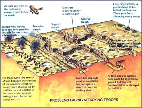
why are there concrete trenches in the mid, i mean building a concrete trench so close to the enemy is kinda unbelievable, again take a look at world war 1, the front trenches where just supported by wooden beams, if at all, but those trenches that where not as close to the frontline where reinforced with concrete see exhibit o. Also why is there a sulfur stone thingy in the mid?

exhibit o
Image

exhibit p
Image

And now the biggest problem with ur object placement is the oasis section shown in exhibit q.

exhibit q
Image

Why are their plants in the middle of the water? I think that u should move those plants that are in the water right now closer to the shore of the lake and remove some of the trees to make it look more like a real oasis as shown in exhibit r.

exhibit r
Image

V. Grass + vegetation

Take a look at this picture and tell me whats wrong about it.

Image

Okay, I'll tell you, first of all u placed some grass on the desert part of the screen but there is no grass in the actual part that should represent the oasis. Now lets take a look where plants grow in the desert.

Image

Image

Image

Image

It is fairly easy to tell that most of desert plants try to shield themselves from the sun by growing where they have some cover to shield them from the sun - like rocks, stones, and other shit. Just take a look at exhibit s and you should notice that this looks way may realistic compared to your map.

exhibit s
Image

Just take a look at some photos and maybe even try to think where would u hide if u would be a plant in the desert. Prolly a somewhat shadowy place and not in the middle of the desert.

Image

VI. Lighting + fog + weather + effects + random stuff

I don't like sandstorm effect, it might just be me, but it looks kinda meh, granted it looks better then the abomination that is the sandstorm on "Armageddon river crossing" but that doesn't count for much I'd say.

For the lighting you should use something different then pink or lila or whatever its called - just select something natural looking for "back light" and "right light" - also turn the intensity of the sunlight up to something like ".5".

Decrease the Fog end thingy - I'd say something like 200 sounds about right - it also helps to hide the edges of the map if a player pans the camera in game and it kinda feels more sandstorm like.

And could u give me an explanation why everything is burning? get rid of most of the flames, it looks silly. Maybe u should use more fire sparks and burning embers, some smoke maybe, but get rid of those flames.

The last thing I wanna mention before I come to my final verdict, is the fact that those hills are way too high, make them lower and create different heights. Right now it looks like u just have 2 height levels - the base level and the hill level, but nothing in between - change that, maybe even remove some of the hills.

VII. Final verdict

First things first, I appreciate the fact that you tried to make a map. Everyone can see that u had a vision and that u really are into map making.

But, to be honest with you, your map doesn't look good man, its just a hotchpotch of different tilesets, splats, objects and stuff, without any cohesion between them. The texture work is subpar, the overall layout is just not good. The map is lacking in the following departments: textures, splats, objects, object placement, splines, grass, lighting, fog.

My advise would be to make a new map, learn from this one and form your mistakes and from the advises u received. Because it would require a like maybe 1 month to make this map good looking and I'm not even talking about the gameplay aspect of it.

Right now id say this map gets a 2 out of 10.

This might sound awfully harsh, but I just can't think of that many positive things that the map has going for it. But it was your first try, so don't give up, give it another try, make a better map and in time we shall see how that new map of yours turns out to be.

Also trust me when I tell u that it can be hard hearing stuff like that about your map, hell even I got frustrated when some guys told me that my first map sucked ass, well i polished that map and now its part of the mod (its Tartarus Harbor - Version 2.0.0) and even those guys that told me that it was a shitty map think that its a good map now.

TL;DR

Not a good map, learn from the advises u received, make a new map and if u have a question about map making just ask either Indrid or me.

Kind Regards Max Power

PS: Well that turned out to be a bit longer than expected. :o
"A fortress is built with blood and toil. Only by blood and toil may it be taken." Leman Russ
User avatar
Castle
Level 2
Posts: 86
Joined: Mon 18 Feb, 2013 7:33 am

Re: A new map, by Castle and HCMW!

Postby Castle » Fri 09 Aug, 2013 12:09 pm

:o :mrgreen: Wow Max! You are a champ man. Very nice response!

Please remember (everyone) that this build for Calderis Canyon was put up for testing. Beta-final means it is still certainly in beta, but the idea is set in place barring major changes...which it most certainly needs.

Thus, I digress: yes, splats are all over the place! I played with a lot of ideas and generally wanted the map to tone down and look dirty early on. The next step of the process from here was to go back through and sort them, if not delete them all and start fresh.

As for the confusion with the tile sets, yes I agree. I only used some, others rarely in layering and have not gone back to check on errors etc...I honestly think the error is from the fact that I have so many loaded. It is buggy, but I will re-read your post and check in on all the issues.

No spline work yet, have not cared to. But I should, especially for this kind of environment.

The oasis/aquifer idea....well, most of those rocks (in exhibit D?) are there because they are 'full blocking', thus ensuring the Power Node does not get shot at through hills etc. As I have said before, there really is not much to cap canyon edges with, that looks convincing. Shot blocking can work of course, but only to such a point and is unclear for players when they approach a ledge but cannot fire. I wanted to make it clear that you cannot fire from most of the higher ledges, and the rocks send a clear signal that you cannot. I guess I could use a lot of bushes with other canyon-y assets that DO fit.... ideas on what exactly will work?

Still, I will be making the higher terrain areas far more flexible.
*an aquifer in a canyon is not necessarily an oasis, jungle-like or palm-like trees do grow in such conditions. This is Calderis after all, not Earth nor a time where our Earth exists anywhere near the same. Plus, there isn't much other foliage that fits the idea in the builder. Thoughts on what to use instead to clearly show no LOS from certain open ledges?

The aquifer is not leaving the map though. It works just fine in my mind and the FX is so nice and dynamic for what would otherwise be a pretty sparse looking desert-canyon setting. If I were to be super accurate/realistic about it I suppose it does not fit. However, 40k is about fictional, fantasy settings that are not all that believable but are fun and intriguing or even odd to think about. I have seen lots of 40k table-top terrain that looks great, but combines various aesthetics to 'suspend disbelief' in fighting a battle in or on some distant sci-fi place.

Reducing the height of the roads and hills should allow for reasonable clearance for units or models firing up heights and will allow a lot more needed flexibility. I will probably just drop the power nodes down to the surface level, thus avoiding firing issues with shooting through terrain etc... with maybe one node blocked off in some neat-o way tactically in a higher position. I simply didn't drop the height yet because I thought this idea could work... after releasing the test build here the more I thought about it, the more I doubted the height working out. All the feedback here clinches the need for height lowering and the many doubts I have had about the size and so on, but I have been stubborn about facing any of it. I've wanted to get the damn thing done and out to be played; been too hasty.

The map is about the size of Green Tooth Gorge, but seems a lot smaller with so much terrain blocked off for height increase. It's going to be interesting to accomodate a larger, likely 2v2 size for a 1v1 :shock:

As for the utter dislike for the terrain/assets overall I was not expecting such a revolt :lol: ;) My thoughts were: it's a map and it poses interesting ways to play and the aesthetic is sold enough. But I see what you are all saying and I have already begun working on it. All the better especially with your awesome post for some guidance 8-)

I worked in professional photography for more than 5 years, and I still hobby in it some (bit rusty I suppose). Lighting and technical details for visual work are no stranger to me. But thanks for all the tips and advice and hard work...I realize some of my skills and knowledge do not yet show in this map design.

Since the 'rain/sand' FX is bothersome to some and generally muddies play I will remove it, though the fog will stay along with the wind sound. That should set the tone enough just fine ('less is more' in atmo settings it seems)

As for the lighting: well I included the skydome in the lighting bake process obviously (desert night), because this is a fictional planet, alien from our reality and would not likely have the same hues or colors in the Calderis atmosphere as here on Earth. Your photos are super appreciated, but are limited in their application especially since I do not have assets nearly as accurate as the plants and rocks as the photos show. Also, (sand)storms can do odd things to lighting--another reason for the violet hue of the skybox being included. And I wanted the scene somewhat closer to evening or late day. If the violet color is that off-putting I will change that too, but it is unlikely. I personally like the dynamic it sets, again, for suspension of disbelief for "fictional narrative" reasons at least.

Overall, the aesthetic has been well received by regular players but not at all from map designers. Not a surprise there, so I can only acquiesce to some of these demands. Sure, the mish-mash of the rocks and so on is not great but it works out; all the rocks are from 'desert' assets in the builder... So besides figuring out how to build a bunch of new assets for the mod, which ain't gonna happen anytime soon, at some point a map idea has to be build with or without the perfect set of objects.

I will read through your post thoroughly in the next few days at some point Max, when I sit down to copy the map over to a larger playable-area template. It will not take a month to fix, but it may take a month to finish with the standards being asked. We shall see though, I find I am quite dedicated and passionate about this kind of work :D

Last but not least: where this idea came from: it started out as a very simple prospect of building a simple map, with bridges between the hills that could be destroyed for tactical changes, and lots of open movement in among a tight 'sandstorm' fog. My uber noob-map-making self at the time had no idea you could not walk under AND over anything in this engine, like a real bridge. Nor that destructible bridges are super bugged and will either crash the game when units are on them when it breaks or cause units to hang, stuck in mid-air if the bridge collapses with units on it. So, I tried making a map that looks like the bridges were cut in a battle before play starts and liked the idea. Then I got into how awesome the height changes are for visuals and play dynamics. Hence, I have arrived here.

I have already mapped out changes that should satisfy the basic design flaws, thus making the camera movement far less intensive, and also making the map more interesting by increasing the size. The narrows have mostly been fixed so far, where vehicles can go up the hills, and I figure I will mark out the narrow passages for walkers and infantry with extra fire lines to warn players of the dangers of trying to flank in such a tight space. Perhaps even a few cheesy corpse props? We shall see how the next stage of major structural changes go, but the major hurdles I see in the end will be the assets matching up comfortably etc. I am sure I will have questions and a need for plenty of feedback in the weeks to come.

Thanks a bunch Max! Super appreciated!
Arbit
Level 3
Posts: 357
Joined: Tue 28 May, 2013 10:00 pm

Re: A new map, by Castle and HCMW!

Postby Arbit » Thu 15 Aug, 2013 4:57 am

This heartwarming display of unfettered criticism may have inspired me to revive my aborted map making.

not joking really :D
My 1v1 map - Imperial Plaza. Revisions are in progress so please check it out and give feedback!
User avatar
MaxPower
Contributor
Posts: 614
Joined: Mon 11 Feb, 2013 10:18 pm
Location: Leipzig

Re: A new map, by Castle and HCMW!

Postby MaxPower » Thu 15 Aug, 2013 7:15 pm

Arbit wrote:This heartwarming display of unfettered criticism may have inspired me to revive my aborted map making.

not joking really :D


good and if the map sux ill let u know hurhurhur :twisted:

Also if u have a question, just ask me
"A fortress is built with blood and toil. Only by blood and toil may it be taken." Leman Russ

Return to “Releases”


Who is online

Users browsing this forum: No registered users and 107 guests